For the second edition of my exploratory data analysis series, I shall be analysing data on trees in the city of Belfast. The dataset is supplied and made accessible by Open Data NI.
In this article I will be showing analysis I have done on the dataset, ranging from clustering of species to nonparametric statistical distributions. I used Wolfram Mathematica to perform all the analyses and generate all images. All the code here is in the Wolfram Language (WL), which is superb for data analysis, especially in a context such as this, where the real-world is being analysed.
By its exploratory nature, this is a lengthy article. I hope that it inspires you to be more curious about the world around you and to explore it further--to ask more questions.
Import dataset
Having downloaded the data, we can import it into Mathematica and automatically extract row and column headers with the help of the SemanticImport function.
dataset = SemanticImport["/Users/marti/Downloads/odTrees.csv"]/. "" -> "N/A"; RandomSample[dataset, 3]

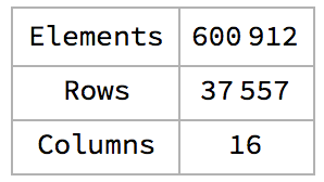
Let's see the dimensions of the data so we can have an idea of how much data we're dealing with.
1dims = {Times @@ #, First@#, Last@#} &@Dimensions@dataset;2dimsGrid = Grid[Transpose@{{"Elements", "Rows", "Columns"}, dims}, gridOpts]
From the sample, we can see the different properties that each of the 37k + entries has. We can also see that there are errors in some of the entries, e.g. the second tree has a diameter of -17cm. We'll further investigate this later.
Overview of data
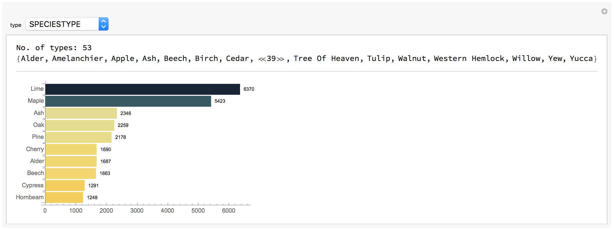
Creating a function that will automatically extract and visualise information on each property will aid our understanding of the dataset.
1set = Reverse@Sort@dataset[GroupBy@property, {Length@#, #} &];23(* plot a barchart of the top 10 most occuring trees *)4chart = BarChart[Reverse@Take[Normal[First /@ set], UpTo@10], BarOrigin -> Left, ChartLayout -> "Grouped", ChartStyle -> colorFunc, LabelingFunction -> (Placed[Style[#1, 8], After] &)];56(* no. and list of sub-properties *)7count = Row[{"No. of types: ", Length@set}];8types = Sort@Normal@Keys@set;9Column[{Column[{count, Short@types}], chart}, Spacings -> 2, Dividers -> Center, FrameStyle -> {Thin, LightGray}]];1011(* visualise properties interactively *)12Manipulate[extractProperties@type, {type, {"TYPEOFTREE", "DESCRIPTION", "SPECIESTYPE", "SPECIES","AGE", "TREESURROUND", "CONDITION"}}]
Sub-properties
Age vs.
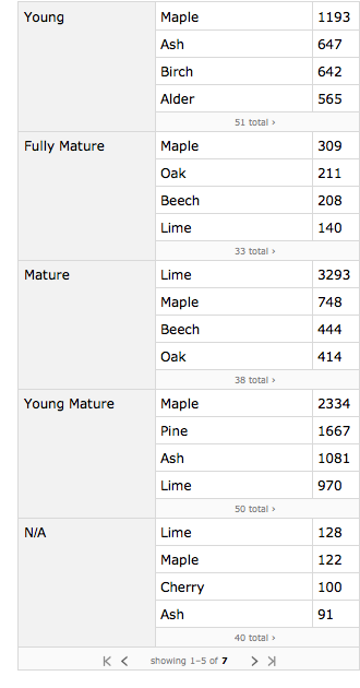
What we're interested in here, is the relationship between one property and the sub-properties of another. Say, for instance, we wanted to know which age group has the highest number of distinct species, and which species occur the most within that particular age group.
1(* find subcategories within the age category *)2setOfAgeFunction[subCategory_String] := Query[All, Tally, subCategory]@dataset[GroupBy[#[[All, {"AGE", subCategory}]], First] &];3sortLevel3[set_] := Reverse@SortBy[Reverse@SortBy[#, Last] & /@ set, Total]; sortLevel3@setOfAgeFunction["SPECIESTYPE"]
Generalising this function to enable us to compare any two properties would be very useful.
1setOfThis$That[setOfThis_String, subCategory_String] := Query[All, Tally, subCategory]@ dataset[GroupBy[#[[All, {setOfThis, subCategory}]], First] &];2setOfAge$Descr = sortLevel3@setOfAgeFunction@"DESCRIPTION";3setOfSpecies$Age = sortLevel3@setOfThis$That["SPECIESTYPE", "AGE"];4setOfSurround$Age = sortLevel3@setOfThis$That["TREESURROUND", "AGE"];
= SpeciesType
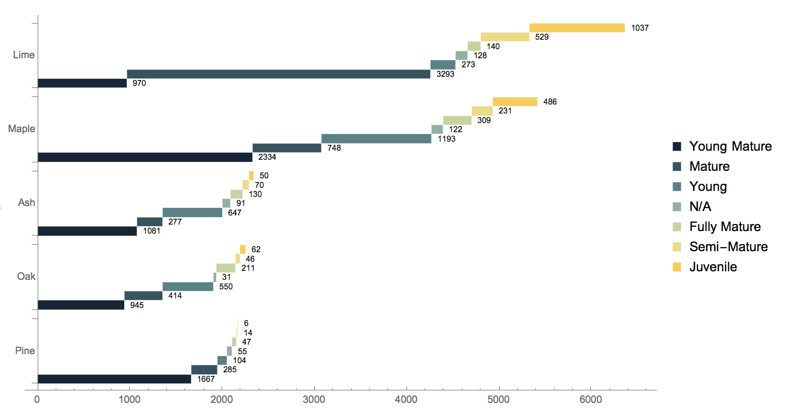
Now we want to see the age distribution of the five most occurring tree types in Belfast.
1Block[{assocOriginal = Normal@Take[Normal[setOfAge$Surround], 5], assocNew},2 assocNew = Association[assocOriginal[[#, 1]] -> Reverse@Sort@Association[Rule @@@ assocOriginal[[#, 2]]] & /@ Range@Length@assocOriginal];3 BarChart[Reverse@assocNew, ChartStyle -> "StarryNightColors", ColorFunction -> Automatic,4 ChartLabels - > {Automatic, None}, ChartLayout -> "Stepped", LabelingFunction -> (Placed[Style[#1, 8], After] &), BarSpacing -> {0, 1}]]
= Description
By doing the same for age and description, we discover that there are subgroups within the Juvenile group: Extra Heavy, Heavy and Select Standards.
1{2 BarChart[SortBy[Association@Thread[Normal[Keys@setOfAge$Descr] -> Normal[Values@setOfAge$Descr] /. {descr_String, count_Integer} :> count], Total], BarOrigin -> Left,3 ChartLayout -> "Stepped", LabelingFunction -> After, ChartLegends -> None],4 setOfAge$Descr5}

= TreeSurround
We can also find out the age distribution of trees in the top five surroundings where they are planted in Belfast.
1Block[{assocOriginal = Normal@Take[Normal[setOfSurround$Age], 5], assocNew},2 assocNew = Association[assocOriginal[[#, 1]] -> Reverse@Sort@Association[Rule @@@ assocOriginal[[#, 2]]] & /@ Range@Length@assocOriginal];3 BarChart[Reverse@assocNew, ChartStyle -> "StarryNightColors", ColorFunction -> Automatic,4 ChartLabels -> {Automatic, None}, ChartLayout -> "Stepped", LabelingFunction -> (Placed[Style[#1, 8], After] &), BarSpacing -> {0, 1}]5]
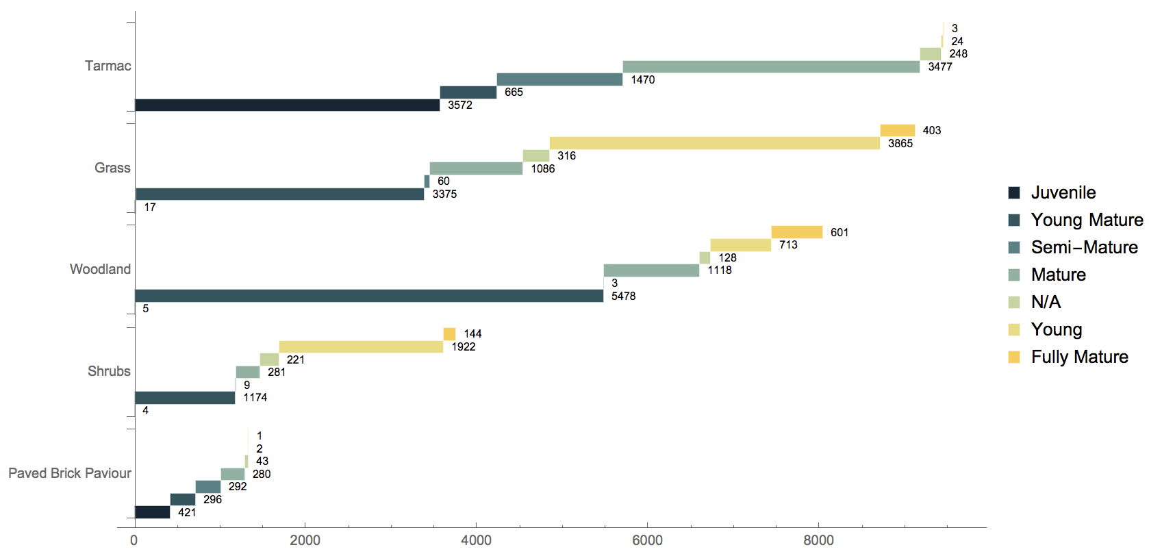
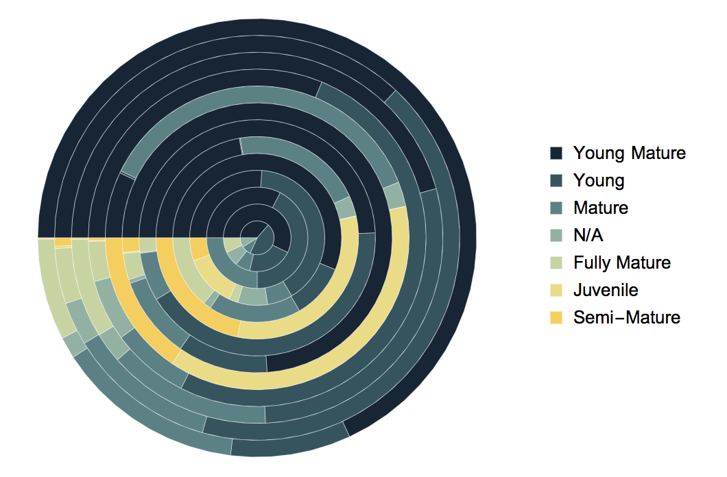
We can also visualise this information to resemble a tree trunk. I have removed the labels to keep the figure neat, but regarding the numbers in the chart above, they can easily be understood.
Looking deeper into the relationship between the ages and surroundings of the trees, we can tabulate the results to offer some insight into where (surrounding not location) one is most likely to find what type of tree. Following these steps:
- Extract the categories surrounding (rows) and age (column).
- Sort each row and column in descending order.
- The orange represents the maximum value in a row, and therefore, each row has one orange value.
- Bold figures show the maximum within the column, and so, each column has a bold number too.
- Orange and bold values are maximum for both the corresponding surrounding and age.

We see that one is most likely to find a Juvenile tree near a tarmac or a paved-brick-paviour, but never on a flower bed.
The origin of species
Let's focus on the species for a bit. We know that there are 53 different types of trees, but there are many more different types of species — 189 in total.
1{allSpeciesTypes, allSpecies} = Reverse@SortBy[Tally@dataset[;; , #], Last] & /@ {"SPECIESTYPE", "SPECIES"};2allSpeciesTypes = Normal@allSpeciesTypes[[;; , 1]];3allSpecies = Normal@allSpecies[[;; , 1]];
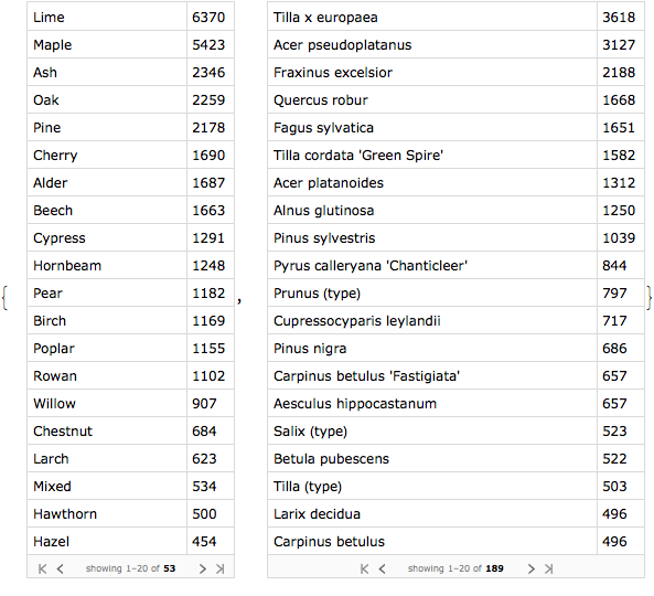
In the image above we see the frequencies of the different species and tree types in the dataset. Having plotted a bar chart of the 10 most occurring in each group earlier, we'll now use word clouds to give a slightly different perspective. On the left, we have the word cloud showing the relative sizes of each item, and on the right, a list showing the 10 most occurring items, as in the bar chart.
1makeWordCloud[category_String] := Block[{tally = Reverse@SortBy[Tally@Normal@dataset[;; , category], Last]},2 Grid[{{WordCloud[tally],Column[Row[#, " - "] & /@ Take[tally, 10], Alignment -> "-"]}},3 Dividers -> {Center, False}, FrameStyle -> Directive[Gray, Dotted], Alignment -> Center, Spacings -> {2, 1}]];4makeWordCloud[#] & /@ {"SPECIESTYPE", "SPECIES"} // Column[#, Spacings -> 2] &
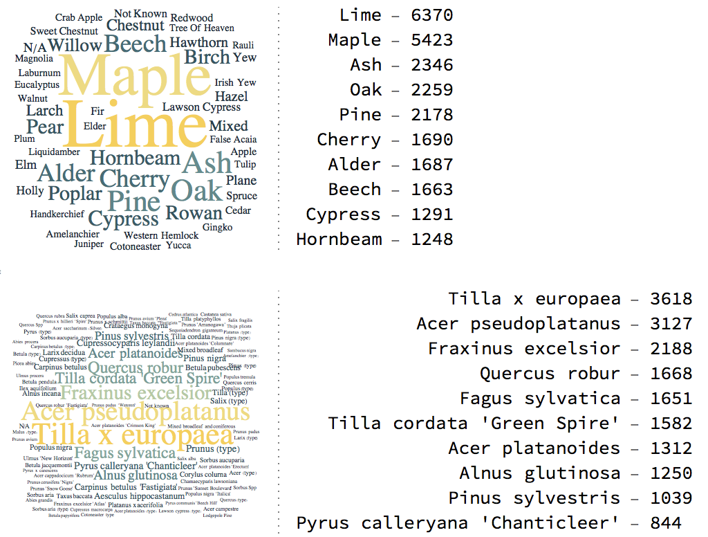
By comparing both word clouds and the adjacent figures, one may speculate that the Tilla species are lime, the Acer ones Maple, and the Fraxinus ones Ash. But we don't know how the species relate to the species types. So let's find out under what type each species falls.
1(* see the different species of lime, maple and ash trees *)2Table[(Style[type, Bold] -> Column[ Normal[DeleteDuplicates@Normal@dataset[Select[(#"SPECIESTYPE" == type) &], {"SPECIESTYPE", "SPECIES"}]][[;; , 2, 2]]]),3 {type, {"Lime", "Maple", "Ash"}}]
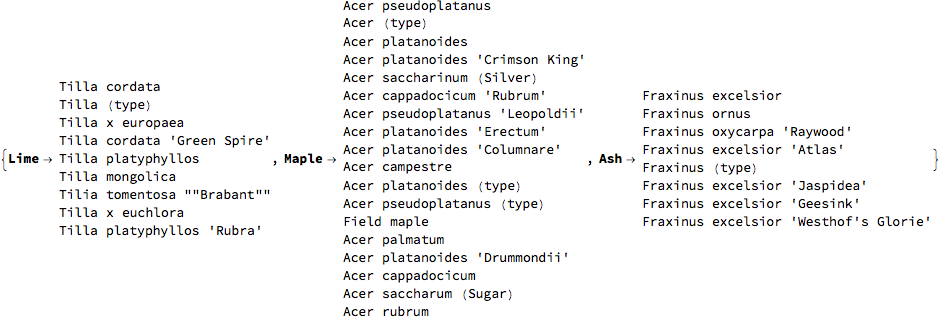
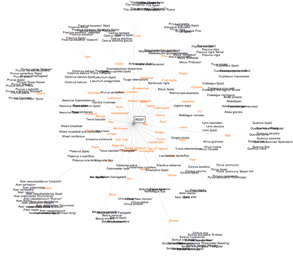
We speculated rightly, it seems. We'll now organise everything into a single graph.
1makeSpeciesRules[speciesType_String] := Thread[speciesType <-> Normal[DeleteDuplicates@Normal@dataset[ Select[(#"SPECIESTYPE" == speciesType) &], {"SPECIESTYPE", "SPECIES"}]][[;; , 2, 2]]];2rootEdgeList = Thread[Framed["ROOT"] <-> allSpeciesTypes];3speciesEdgeList = Flatten[makeSpeciesRules[#] & /@ allSpeciesTypes];4allEdges = Join[rootEdgeList, speciesEdgeList];5g = Graph[allEdges, Properties -> Table[allSpeciesTypes[[i]] -> {VertexLabels -> Placed[ Style[allSpeciesTypes[[i]], Orange, 10], After]}, {i, Range@Length@allSpeciesTypes}], EdgeStyle -> Flatten[{Thread[rootEdgeList -> {Black, Thin, Opacity[.7]}, List, 1],6 Thread[speciesEdgeList -> {GrayLevel[.5], Thickness[.0005], Dotted}, List, 1]}], VertexSize -> .3, VertexStyle -> Directive[LightBlue, EdgeForm[Gray]], VertexLabels -> "Name", ImageSize -> 1000]
Clustering
By forming a hierarchical cluster plot, we can group all species. We see that tree types with very few species are grouped together, while the others surround them.
1clustTree = Block[{tally = Reverse@SortBy[Tally@Normal@dataset[;; , "SPECIES"], Last]},2ClusteringTree[tally[[;; , 1]], ClusterDissimilarityFunction -> "Complete", GraphLayout -> "RadialDrawing", VertexSize -> 0, ImageSize -> 1000]]
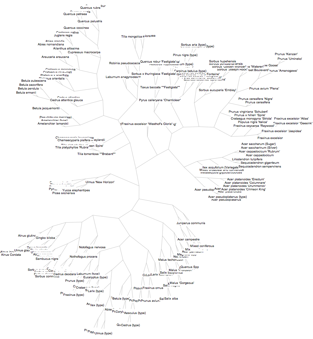
We can also create a Dendogram using Dendrogram[clustTree] although this will have to be very well enlarged to be clear
More on Graphics
We can attempt visualising the different subgroups of species (genera and families).
1HighlightGraph[clustTree, Map[Subgraph[clustTree, #] &,2 FindGraphCommunities[clustTree, Method -> "Spectral"]], GraphHighlightStyle -> "DehighlightFade", ImageSize -> 1000]
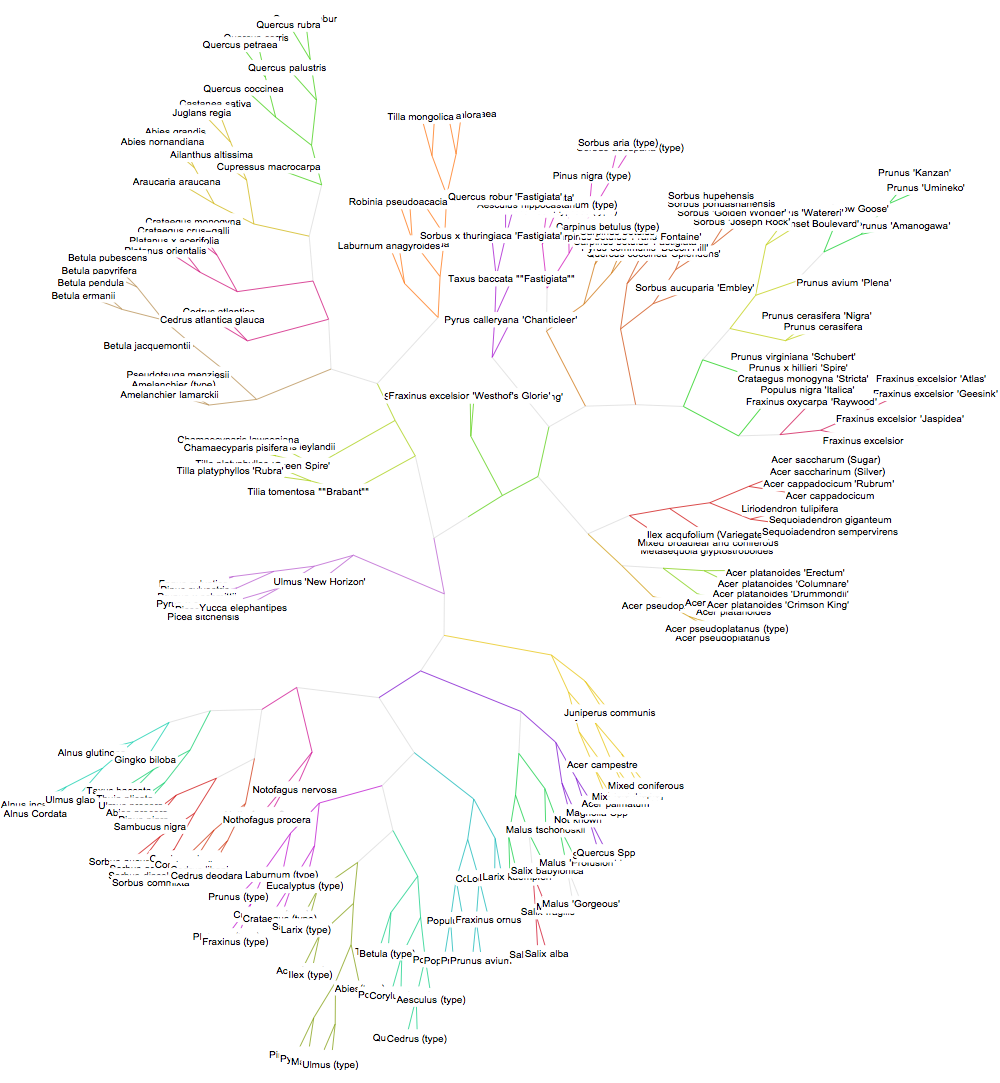
Within such a rich network, one may be curious to know which species is farthest from the ROOT. Also known as the periphery of a graph, this is the most distant species from at least one other species in the graph).
1(* clustering tree properties *)2propAssoc = PropertyValue[clustTree, "LeafLabels"];3propAssocReversed = Association@Thread[Values@propAssoc -> Keys@propAssoc];4propAssoc[[Key[#]]] & /@ GraphPeriphery[clustTree] // Column
1Pinus (type)2Pyrus (type)3Malus (type)4Ulmus (type)5Prunus 'Umineko'6Prunus 'Kanzan'
And the centre of the graph (i.e., the vertex with the least eccentricity).
propAssoc[[First@GraphCenter@clustTree]] Tilla x europaea
And also the distances between vertices. The brighter the region, the farther the two corresponding vertices are from each other, and vice versa.
1mat = GraphDistanceMatrix[clustTree];2{MatrixPlot[mat, ColorFunction -> "StarryNightColors", ImageSize -> 300],3 Histogram[Flatten[mat], ColorFunction ->4 ColorFunction -> Function[{x, y}, ColorData["NeonColors"][y]], ChartStyle -> "StarryNightColors", ImageSize -> 400]}
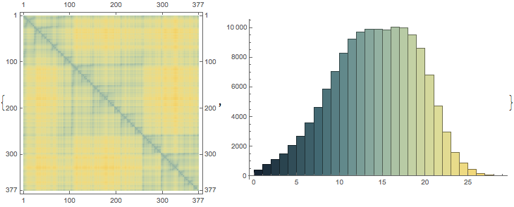
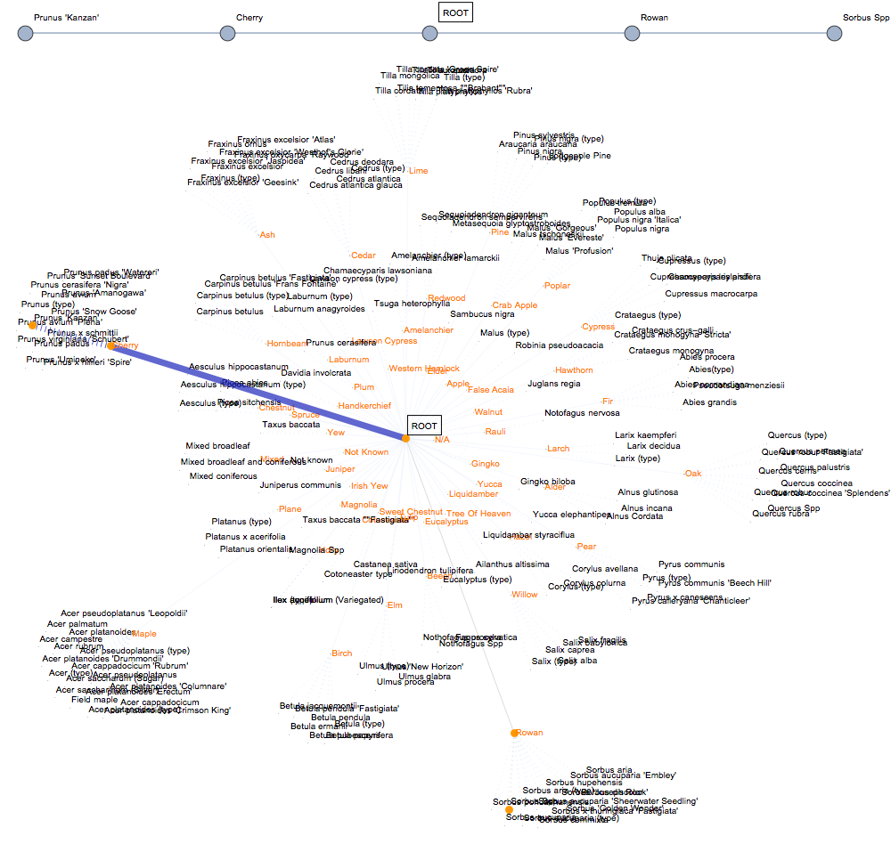
Given the linear nature of its connectivity, we'd only expect a single flow from the graph centre to any other vertex. Nonetheless, this is very useful for understanding the relationship between species, with regards to the classification of species. So to go from one type of tree to another, one must pass through the ROOT! Let's visualise the flow from Sorbus Spp (cherry tree) to Prunus 'Kanzan' (rowan tree).
1{2 Graph[FindMaximumFlow[g, "Sorbus Spp", "Prunus 'Kanzan'", "EdgeList"], VertexLabels -> "Name", ImageSize -> 1000],3 Show[FindMaximumFlow[g, "Sorbus Spp", "Prunus 'Kanzan'", "FlowGraph"], ImageSize -> 1000]4} // Column
Tree dimensions
Whilst doing my analysis, I came across an issue I'd like to highlight. There are some negative tree dimensions, which cannot (physically) be. Here we see cases where any of the diameter, spread radius or height of a tree can be negative.
1faultyData = Select[dataset, (#"DIAMETERinCENTIMETRES" < 0 || #"SPREADRADIUSinMETRES" < 0 || #"TREEHEIGHTinMETRES" < 0) &];2{3 Length@faultyData, RandomSample[faultyData[;; , {"DIAMETERinCENTIMETRES", "SPREADRADIUSinMETRES", "TREEHEIGHTinMETRES"}], 5]4}

I also found 10 cases in which all dimensions where all dimensions were recorded as negative. I derived a new dataset of only positive dimensions and used it from this point onwards. You can see the min and max values of the new dataset below.
1datasetPos = dataset[Select[(#"DIAMETERinCENTIMETRES" >= 0 && #"SPREADRADIUSinMETRES" >= 0 && #"TREEHEIGHTinMETRES" >= 0) &]];2Column[{#, datasetPos[MinMax, #]}] & /@ {"DIAMETERinCENTIMETRES", "SPREADRADIUSinMETRES", "TREEHEIGHTinMETRES"}

The maximum figures seem rather unimaginable. A maximum spread radius of 500m and a maximum height of 832m suggests something could be wrong with the dataset. We'll discuss this further later.
Distributions
Using the FindDistribution function, we can find the distribution of the numerical properties.
1Grid[Block[{props = {"DIAMETERinCENTIMETRES", "SPREADRADIUSinMETRES", "TREEHEIGHTinMETRES"}}, MapThread[List, {props,FindDistribution[#, PerformanceGoal -> "Quality"]2 & /@ Transpose[Values /@ Normal@dataset[;; , props]]}]], gridOpts]

As expected, we see that all three properties follow a discrete uniform distribution. Additionally, the diameter can also be described using mixture and geometric distributions.
Let's visualise the distribution of the diameters of trees, based on a few properties.
1plotHistogram[property_String] := Block[{set, setLen, setMaxAllowed, extractColumn, plots},2 set = datasetPos[GroupBy@property]; setLen = Length@set;3 setMaxAllowed = If[setLen >= 10,RandomSample[set, 7], set];4 extractColumn = setMaxAllowed[;; , ;; , "DIAMETERinCENTIMETRES"]; plots = If[Length@# <= 1, "Only " <> ToString[Length@#] <> " value(s) available.",5 Show[{ Histogram[#, 20, "PDF", Axes -> {True, False}],6 SmoothHistogram[#, 5, PlotStyle -> {Orange, Thickness[.002]}, Filling -> Axis, FillingStyle -> Directive[Opacity[0.4], White]] }, AspectRatio -> 1/3, ImageSize -> 200] ] & /@ extractColumn;7 Column[{StringJoin[{property, " (", If[setLen == 7, "7", "random sample of 7,"], " of ", ToString@setLen, ")"}],8 Text@Grid[Transpose[(#@Normal@plots) & /@ {Keys, Values}], gridOpts]}, Alignment -> Center] ];9 plotHistogram /@ {"AGE", "CONDITION", "SPECIESTYPE"}
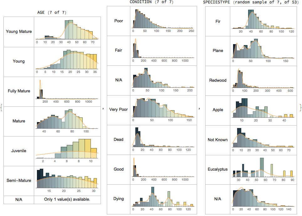
Here are the histograms of dimensions, based on the different age groups.
1Framed[Column[{#, Histogram[Most@datasetPos[GroupBy["AGE"], ;; , #],2ChartLayout -> "Stacked", ChartLegends -> Automatic, PlotRange -> Automatic, ChartStyle -> "StarryNightColors", ChartBaseStyle -> {Directive[Opacity[1]], EdgeForm[{White, Thin, Opacity[.5]}]}, ImageSize -> 220]}, Alignment -> Center], FrameStyle -> {GrayLevel[.7], Thin}]3 & /@ {"DIAMETERinCENTIMETRES", "SPREADRADIUSinMETRES", "TREEHEIGHTinMETRES"}

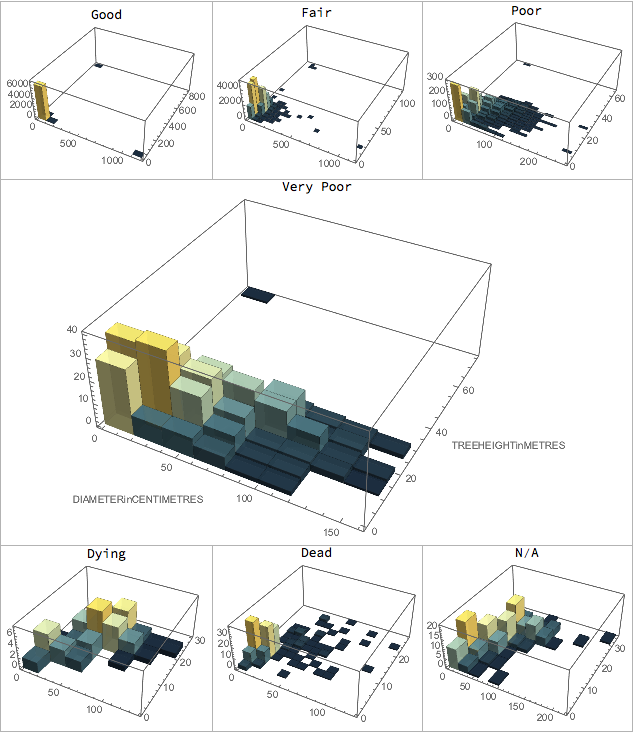
To give a better perspective, here's a 3D histogram comparing the diameter (y-axis) & height (x-axis).
1plotHistogram3D[property_] := Block[{plot},2plot = Histogram3D[datasetPos[GroupBy["CONDITION"], ;; , {"DIAMETERinCENTIMETRES", "TREEHEIGHTinMETRES"}][property], ColorFunction -> Function[{height}, ColorData["StarryNightColors"][height]], ChartBaseStyle -> Directive[Opacity[.9]], ImageSize -> If[property == #, 500, 200], PerformanceGoal -> "Quality", AxesLabel -> If[property == #, Automatic, None]]3 &@ "Very Poor"; Column[{property, plot}, Alignment -> Center]];4Grid[{5 {plotHistogram3D@"Good", plotHistogram3D@"Fair", plotHistogram3D@"Poor"},6 {plotHistogram3D@"Very Poor", SpanFromLeft, SpanFromLeft},7 {plotHistogram3D@"Dying", plotHistogram3D@"Dead", plotHistogram3D@"N/A"}},8 Frame -> All, FrameStyle -> {GrayLevel[.7], Thin}]
Classification
The WL has quite extensive machine learning capabilities, as we've seen with clustering. In this section, I'll explain how I used machine learning to predict the specific type of a tree based on its other properties. This is called supervised learning and can be done by generating a classifier which learns from the examples it is trained with.
We'll have to process the data such that it will become fit (taking in all other properties and giving species type as output) for training in the WL. It is important to note that the training process will be affected by the number of examples of each tree available. Whereas there are up to 6370 examples of Lime, there is only a single example of Rauli and Handkerchief trees.
1(* extract properties to be used for prediction *)2d = datasetPos[;; , {"TREEHEIGHTinMETRES", "DIAMETERinCENTIMETRES", "SPREADRADIUSinMETRES", "TYPEOFTREE", "SPECIESTYPE", "AGE", "TREESURROUND", "CONDITION"}];3Multicolumn[Row[#, " - "] & /@ Reverse@SortBy[Tally@Flatten@Values@Normal@dataset[;; , {"SPECIESTYPE"}],Last], 3, Alignment -> Right]
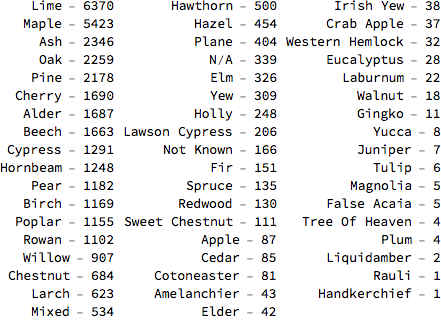
I only included trees with up to 1000 examples—so from Lime to Rowan.
1(* process dataset to make it suitable for training *)2dAll = Cases[Thread[Values@Normal@d[;; , {"TREEHEIGHTinMETRES", "DIAMETERinCENTIMETRES",3 "SPREADRADIUSinMETRES", "TYPEOFTREE", "AGE", "TREESURROUND", "CONDITION"}] ->4 Normal@d[;; , "SPECIESTYPE"]], (l_ -> sp_ /; Or @@ MapThread[sp == # &,5 {{"Lime", "Maple", "Ash", "Oak", "Pine", "Cherry", "Alder", "Beech", "Cypress", "Hornbeam", "Pear", "Birch", "Poplar", "Rowan", "Willow", "Chestnut", "Larch", "Mixed", "Hawthorn", "Hazel", "Plane", "N/A", "Elm", "Yew", "Holly", "Lawson Cypress"}}6 ]) :> (l -> sp), Infinity];78(* randomly rearrange all entries *)9SeedRandom[1]; dAll = RandomSample[dAll, Length@dAll];10(* select training, validation and test sets *)11Block[{l = Floor[0.20*Length[dAll]]},12 dTest = dAll[[;; l]]; dVal = dAll[[l + 1 ;; 2*l]];13 dTrain = dAll[[(2*l) + 1 ;;]];14]
I initially tried a few different classification methods including Nearest Neighbours, Neural Networks and SVMs. I eventually selected the Random Forest method, as it gave the best results.
1c = Classify[dTrain,2FeatureNames -> {"Age", "Surround", "Condition", "Height", "Diameter", "Spread"},3FeatureTypes -> <|"Age" -> "Nominal", "Surround" -> "Nominal", "Condition" -> "Nominal", "Height" -> "Numerical", "Diameter" -> "Numerical", "Spread" -> "Numerical"|>,4ValidationSet -> dVal, Method -> "RandomForest", PerformanceGoal -> "Quality" ];
This generated a classifier function:

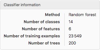
Now we can use the classifier to figure out was species type a tree probably is, given the preset properties. We'll look at two examples:
- Tree 1: , , , , ,
- Tree 2: , , , , ,
1Column[With[{tree = #}, {Framed@c[tree, "Decision"], Grid[c[tree, {"TopProbabilities", 5}]2 /. Rule -> List, gridOpts]} ], Alignment -> Center]3 &/@ {{"Mature", "Woodland", "Good", 7, 140, 3}, {"Young", "Tarmac", "Dying", 2, 15, 1}}
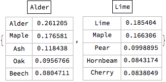
Tree 1 is classified as an Alder while Tree 2 is classified as a Lime tree. But how can we tell if these predictions are accurate? Using the test dataset we created earlier, we'll be able to work out the accuracy of the classifier, based on how many trees it predicts right or wrong.
{cm = ClassifierMeasurements[c, dTest], Framed@cm["Accuracy"]} // Column

The accuracy of the classifier is about 0.44, which is pretty low and therefore unreliable. We can easily plot a confusion matrix plot to see its performance for each tree.
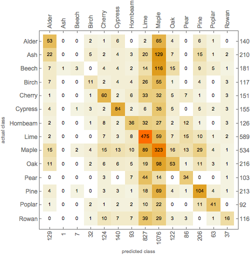
From the plot, we can see that all of the trees had examples that were misclassified as Maple and Lime trees. This is probably owed to the relatively large numbers of these trees in the training set. Interestingly, none of the Ash trees was correctly classified, despite the relatively large number of Ash examples in the training dataset.
Having an equal number of examples for each tree in the training set might improve the accuracy of the classifier. Furthermore, other options could be used to fine-tune the training process, that I didn't look at. So perhaps one could iteratively try out a combination of different options to obtain a better result.
Neural Networks
Following the documentation example, I was able to train a neural network (NN) to predict the type of tree (out of Poplar, Oak, Cherry, Alder, Pine) given its surrounding, condition and height. I used 70% of the dataset for training, and 15% for testing and validation each.
1(* select training, validation and test sets *)2SeedRandom[1];3dAll = RandomSample[dAll, Length@dAll];4Block[{dAll = Cases[dAll, (l_ -> sp_ /; Or @@ MapThread[sp == # &, {{"Poplar", "Oak", "Cherry", "Alder", "Pine"}}]) :> (l[[{2, 3, 4}]] -> sp), Infinity], l},5 l = Floor[0.1*Length[dAll]];6 dTest2 = dAll[[;; l]];7 dVal2 = dAll[[l + 1 ;; 2*l]];8 dTrain2 = dAll[[(2*l) + 1 ;;]];]
The following are the different types of trees we're aiming to be able to tell apart using the NN, and all properties (except height which are discrete integers).
1labels = Union[Values@dTrain2];2surroundValues = DeleteDuplicates[dTrain2[[All, 1, 1]]];3condValues = DeleteDuplicates[dTrain2[[All, 1, 2]]];

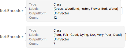
We'll encode these sets of properties as tensors, to be later used in the NN. For each property, it creates a tensor and assigns a value of 1 for that property and 0 for all others.
1encSurround = NetEncoder[{"Class", surroundValues, "UnitVector"}]2encCond = NetEncoder[{"Class", condValues, "UnitVector"}]
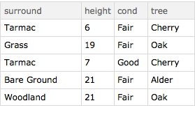
Here's a small sample of the training dataset.
1trainingData = dTrain2; testData = dTest2;2convertRow[{s_, c_, h_} -> tree_] := <|"surround" -> s, "height" -> IntegerPart@h, "cond" -> c, "tree" -> tree|>; trainingDataset = Dataset[convertRow /@ trainingData];3testDataset = Dataset[convertRow /@ testData];4valDataset = Dataset[convertRow /@ dVal2];5RandomSample[trainingDataset, 5]
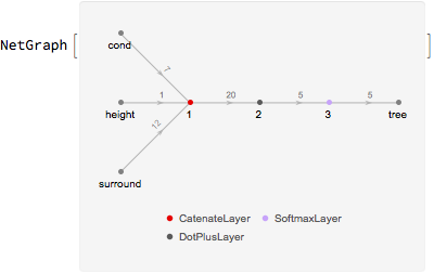
The neural network can be represented in a graphical form, showing the inputs and the output.
1net = NetGraph[{CatenateLayer[], DotPlusLayer[5], SoftmaxLayer[]},2 {{NetPort["surround"], NetPort["height"], NetPort["cond"]} -> 1,1 -> 2 -> 3 -> NetPort["tree"]}, "surround" -> encSurround, "height" -> "Scalar", "cond" -> encCond, "tree" -> NetDecoder[{"Class", labels}]]
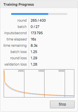
The training can now be done, specifying the validation dataset. We'll also set a limit to the number of training rounds to be carried out to 400.
1net = NetTrain[net, trainingDataset, MaxTrainingRounds -> 400, BatchSize -> 256, ValidationSet -> valDataset]
Using the NN, let's find out what a dying -tall tree in, surrounded by Tarmac is likely to be.
1net[<|"surround" -> "Tarmac", "height" -> 13, "cond" -> "Dying"|>] net[<|"surround" -> "Tarmac", "height" -> 13, "cond" -> "Dying"|>, "Probabilities"]
Cherry it says. What if we wanted to know the likelihood of a tree being a Pine tree? We can create a function that takes in our desired properties and returns the probability of such a tree being Pine.
1p[surround_String, height_Integer, cond_String] := net[<|"surround" -> surround, "height" -> height, "cond" -> cond|>, {"Probabilities", "Pine"}];2{p["Concrete", 44, "Fair"], p["Woodland", 12, "Poor"]}3{0.506814, 0.215295}
Furthermore, we can find an optimum height at which, in addition to other properties, a tree is likely to be a Pine tree.
1ListLinePlot[{2 Table[{x, p["Grass", x, "Good"]}, {x, 0, 150}],3 Table[{x, p["Tarmac", x, "Good"]}, {x, 0, 150}],4 Table[{x, p["Grass", x, "Poor"]}, {x, 0, 150}],5 Table[{x, p["Tarmac", x, "Poor"]}, {x, 0, 150}] }, PlotLegends -> {"Grass, Good", "Woodland, Good", "Grass, Poor", "Woodland, Poor"}, Frame -> True, FrameLabel -> {"Height (m)", "Probability of being Pine"}]
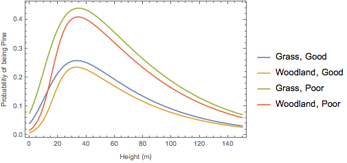
It appears that a tree in poor condition, especially on grassland, is most likely to be a Pine tree if it’s about tall.
But how accurate are these predictions? Will the NN be any better than the classifier we generated earlier?
1Column[{cm = Framed@ClassifierMeasurements[net, testDataset -> "tree", "Accuracy"],2ClassifierMeasurements[net, testDataset -> "tree", "ConfusionMatrixPlot"]}, Alignment -> Center]
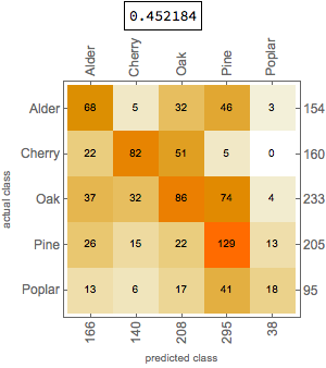
The neural network is only slightly more accurate than the Random Forest classifier. Bear in mind though that the properties and trees analysed are different.
Geographics
As I mentioned earlier, the WL is great for computing with real-world knowledge. One of the ever-growing areas in which Wolfram Research has curated, organised and made such knowledge computable is geography. In this section, we'll be exploiting this set of functions not only to visualise the location of every tree but also to learn a few things about their distribution.
The dataset contains the geographical coordinates (longitude and latitude) of every tree up to a precision of five decimal places.
1(* gather the location and condition of every tree *)2d2 = dataset[;; , {"LONGITUDE", "LATITUDE", "CONDITION"}];
When visualising the trees, we can colour each one according to its condition.
1allConditions = DeleteDuplicates[Normal@dataset[;; , "CONDITION"]][[{6, 2, 1, 3, 7, 5, 4}]];2conditionColouring[condition_] := Switch[condition, "Good", Darker@Green, "Fair", Green, "Poor", RGBColor[0.9, 1, 0], "Very Poor", Orange, "Dying", Pink, "Dead", Darker@Red, "N/A", Blue];3(* legend of rating *)4ratingLengend = SwatchLegend[conditionColouring /@ allConditions, allConditions];5(* apply properties to each tree *)6d2Coloured = Normal[Values[d2] /. {lon_, lat_, con_} :> {conditionColouring[con], Opacity[.5], PointSize[.007],Point@GeoPosition[{lat, lon}]}];7(* apply property only for the tree condition is specified *)8d2ColouredSelect[condition_String] := Normal[Values[d2] /. {lon_, lat_, con_} :> If[con == condition, {conditionColouring[condition], Opacity[.5], PointSize[.0075], Point@GeoPosition[{lat, lon}]}, Nothing]];
We can also set the range we're interested in. Below are two maps: one covering the entire city and the other covering only half a kilometre.
1largeMap = Legended[GeoGraphics[d2Coloured], ratingLengend];2smallMap = GeoGraphics[d2Coloured, GeoCenter -> bel, GeoRange -> Quantity[.5, "Kilometers"]]; Row[{largeMap, smallMap}]
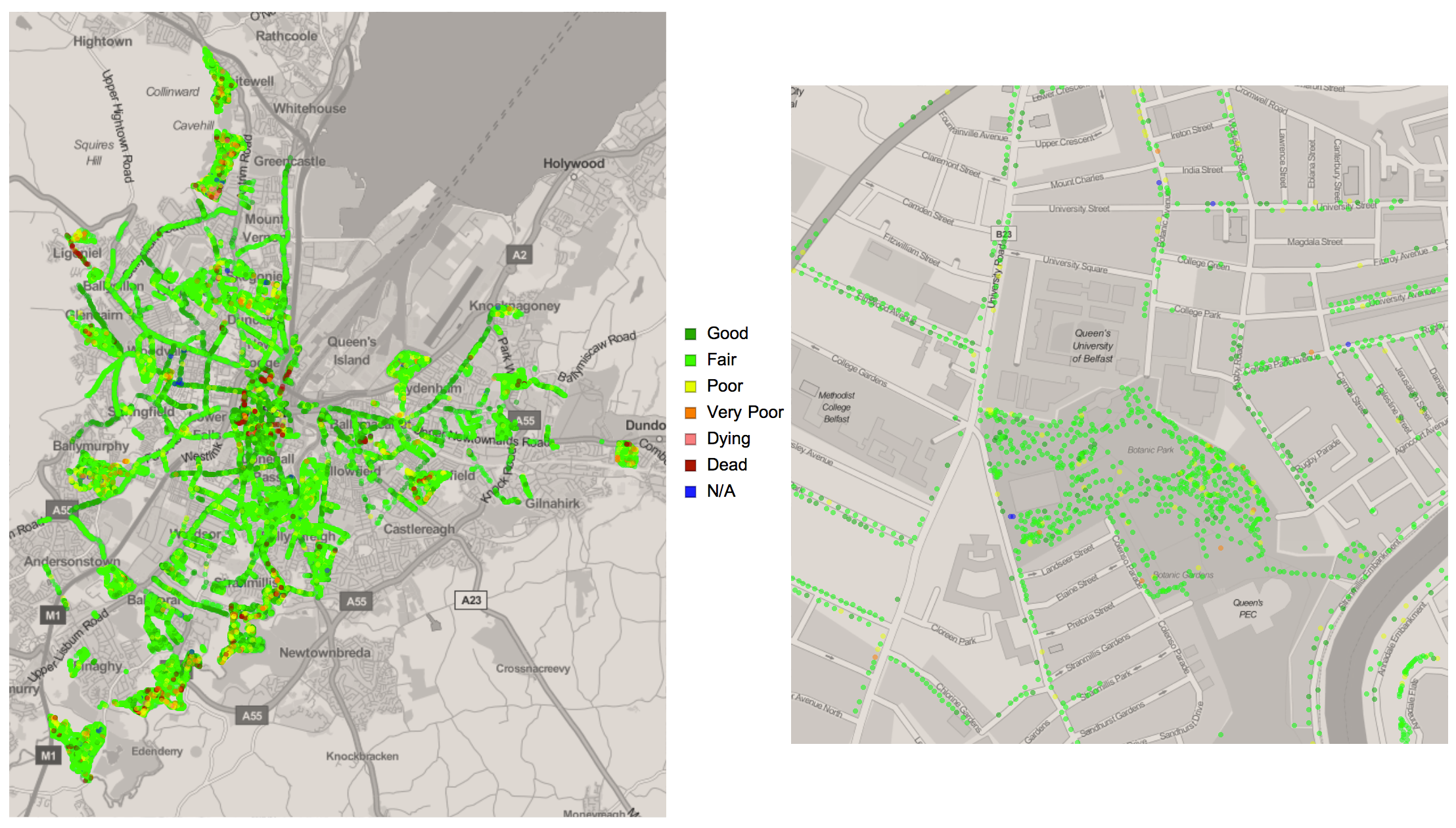
The map on the left is meant to give an idea of how the trees are spread around the city. The one on the right shows in greater detail, the positions of the trees. One can see the alignment of trees on either side of a street, and indeed, the cluster trees in a park. However, even using both maps, it is difficult to discern which part of Belfast has the highest number of trees just by looking. To find out we'll use specialised visualisations functions in the WL.
GeoHistograms
The GeoHistogram function allows one to plot a histogram on a map with complete control of bin sizes, which may be represented by hexagons, rectangles, triangles, or well-defined geographical boundaries. We begin by attempting to answer the question, which in retrospect, is rather vague:
I found that the answer to this question depends on the area of the "part". As the area of the bin changes, the region with the highest density also changes. To demonstrate this phenomenon, we'll plot GeoHistograms showing the relative densities of trees using bin sizes ranging from to , in increments of .
1dat = Normal[GeoPosition /@ Reverse /@ Values@d]; plotGeoHistogram[squareKm_] := Block[{rectangleSize = Quantity[squareKm, "Kilometers"]}, Column[{Framed[rectangleSize, FrameStyle -> {GrayLevel[.7], Thin}], GeoHistogram[dat, {"Rectangle", {rectangleSize, rectangleSize}}, ColorFunction -> (ColorData[{"StarryNightColors", "Reverse"}][#] &)]}, Alignment -> Center] ];2geoHistList = Table[plotGeoHistogram[i], {i, Range[.5, 5, .5]}]; Export["GeoHistograms.gif", geoHistList, "DisplayDurations" -> 2, ImageResolution -> 200]

We see that as the bin size approaches , the region with the highest density moves closer to the centre of the city.
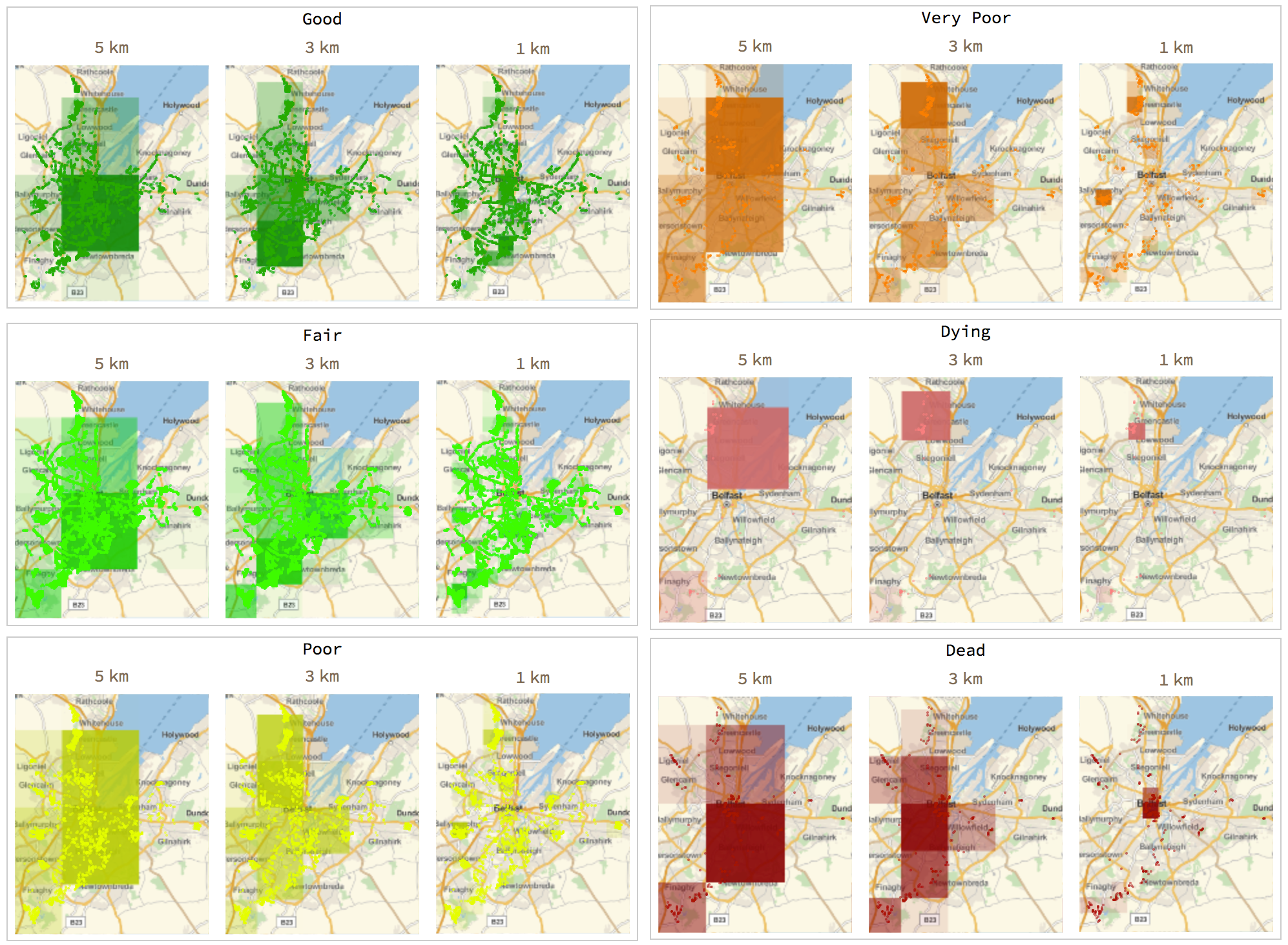
Based on condition
We can also plot geo-histograms based on properties. This can be quite insightful when one is keen on knowing where the dying trees are. Another example of its importance would be correlating the location of a plant infection to the location of affected trees.
1plotGeoHistoConditions[condition_String, squareKm_: 2] := Block[{geoHist, selectCondition, rectangleSize},2selectCondition = d2ColouredSelect[condition]; rectangleSize = Quantity[squareKm, "Kilometers"];3geoHist = GeoHistogram[selectCondition[[;; , 4, 1]], {"Rectangle", {rectangleSize, rectangleSize}}, ColorFunction -> (Opacity[# - .1, Darker[conditionColouring@condition, .2]] &), ImageSize -> 150, PerformanceGoal -> "Quality"];4Column[{rectangleSize, GeoGraphics[selectCondition, GeoBackground -> GeoStyling[{"GeoImage", Rasterize@geoHist}], ImageSize -> 150]}, Alignment -> Center]];56listOfGeoHists = Table[Column[{cond, Grid[{ParallelTable[plotGeoHistoConditions[cond, s], {s, {5, 3, 1}}]}, Spacings -> {1, 0}]}, Alignment -> Center, Frame -> True, FrameStyle -> GrayLevel[.8]], {cond, {"Good", "Fair", "Poor", "Very Poor", "Dying", "Dead"}}] //Multicolumn[#, 2, Alignment -> Right] &
Kernel density estimation
Using the SmoothKernelDistribution function, we can smoothen the noise of the tree distributions, thereby creating precise estimates of the densities of trees in all regions around the city. Following the WL documentation and using the Silverman bandwidth selection method, I plotted the estimated densities around the entire city. By altering the PDF function, the precision of the estimation can be improved.
1(* function for automation *)2plotKernelDistribution[bandwith_String: "Silverman", PDFPower_Integer] := Block[{latmin, latmax, longmin, longmax, \[ScriptCapitalD], dens, geoPlot}, {{latmin, latmax}, {longmin, longmax}} = GeoBounds@bel;3\[ScriptCapitalD] = SmoothKernelDistribution[dat[[All, 1]], bandwith];4dens = ContourPlot[Evaluate[PDF[\[ScriptCapitalD], {y, x}]^(1/PDFPower)], {x, longmin, longmax}, {y, latmin, latmax}, Frame -> False, PlotRange -> All, Contours -> 10, ColorFunction -> (Directive[ColorData[{"StarryNightColors", "Reverse"}][#], Opacity[0.4]] &), ContourStyle -> {Black, Thin}, PlotRangePadding -> None, PerformanceGoal -> "Quality"];5geoPlot = With[{p = Polygon@bel}, GeoGraphics[{{FaceForm@LightBrown, EdgeForm@Gray, p}, GeoStyling[{"GeoImage", dens}], p, Orange, Opacity[0.3], PointSize[0.0025], Point[dat]}, GeoZoomLevel -> 12, GeoBackground -> GeoStyling["StreetMap", GeoStylingImageFunction -> (ImageAdjust[ColorConvert[#1, "Grayscale"], {.5, -.2}] &)], GeoScaleBar -> Placed["Metric", {Right, Top}], ImageSize -> 500]]; Column[{Framed[PDFPower, gridOpts], geoPlot}, Alignment -> Center] ];6kernelPlotList = ParallelTable[plotKernelDistribution@p, {p, Range[2, 20, 2]}]; Export["SmoothKernelDistribution.gif", kernelPlotList, "DisplayDurations" -> 2, ImageResolution -> 200]

As with the geo-histograms, the more yellow the regions is, the smaller the tree density and vice versa. We can now apply this to each condition, showing how trees, based on their conditions, are spread across Belfast.
1(* function for automation *) plotKernelDistribution2[condition_] := Block[{latmin, latmax, longmin, longmax, \[ScriptCapitalD], dens, geoPlot, selectCondition}, selectCondition = d2ColouredSelect[condition];{{latmin, latmax},2{longmin, longmax}} = GeoBounds@bel;3\[ScriptCapitalD] = SmoothKernelDistribution[selectCondition[[;; , 4, 1, 1]], "Silverman"];4dens = ContourPlot[Evaluate[PDF[\[ScriptCapitalD], {y, x}]^(1/5)], {x, longmin, longmax}, {y, latmin, latmax}, Frame -> False, PlotRange -> All, Contours -> 5, ColorFunction -> (Directive[ColorData["StarryNightColors"][#], Opacity[0.4]] &), ContourStyle -> {Black, Thin}, PlotRangePadding -> None, PerformanceGoal -> "Quality"];5geoPlot = With[{p = Polygon@bel}, GeoGraphics[{{FaceForm@LightBrown, EdgeForm@Gray, p}, GeoStyling[{"GeoImage", dens}], p, selectCondition}, GeoZoomLevel -> 12, GeoBackground -> GeoStyling["StreetMap", GeoStylingImageFunction -> (ImageAdjust[ColorConvert[#1, "Grayscale"], {.5, -.2}] &)], GeoScaleBar -> Placed["Metric", {Right, Top}], ImageSize -> 250]];6Framed[Column[{Style[condition, conditionColouring@condition], geoPlot},Alignment -> Center], gridOpts] ] ParallelTable[plotKernelDistribution2@cond, {cond, allConditions}]
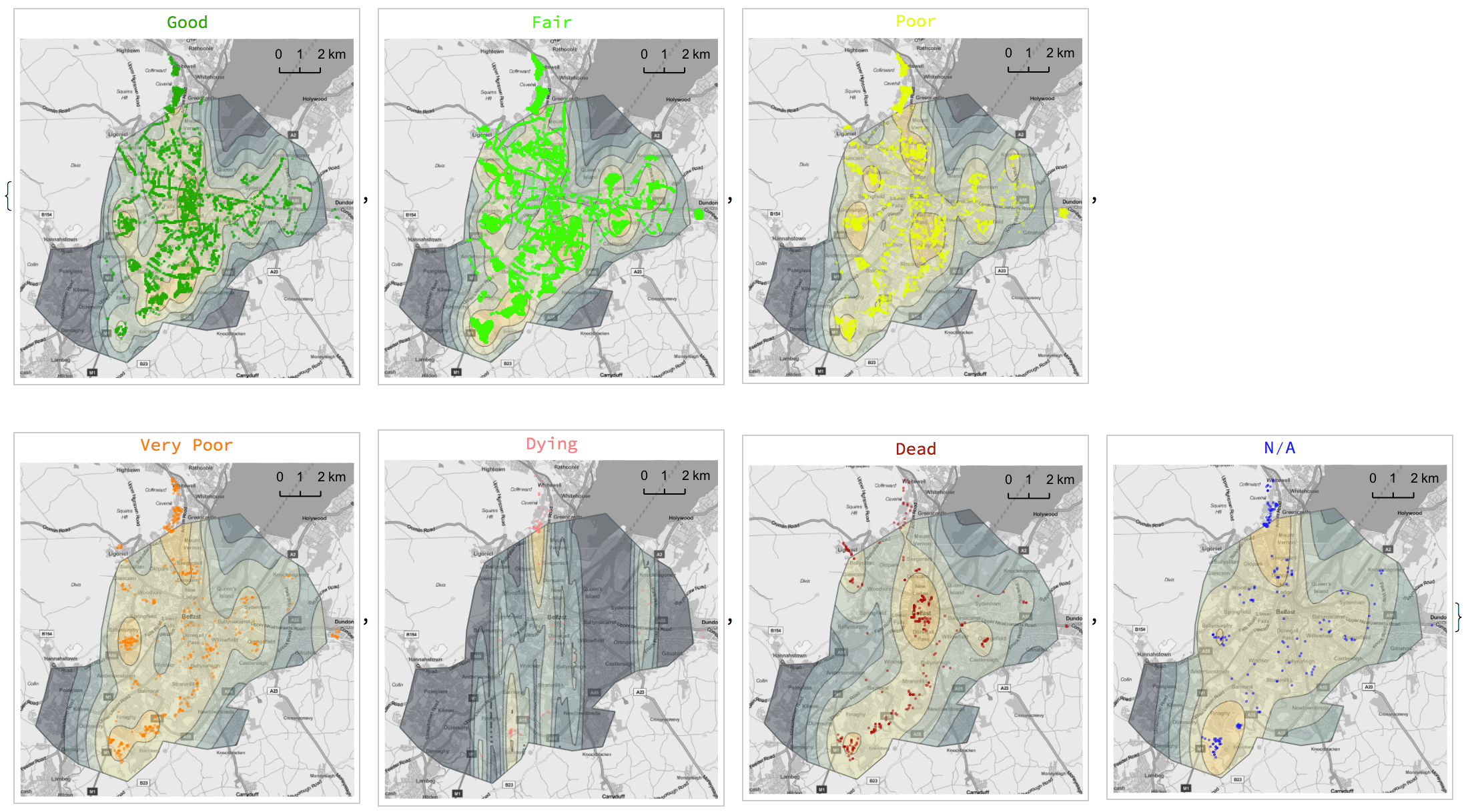
Note that the data covers the outskirts of Belfast to the North. However, the geographical boundary we have defined only includes Belfast. That is why we have points outside of the contour plot, although these are a part of the data used for the estimation.
3D model
Since we have the location and height of each tree, we can generate a three-dimensional model of the city's trees. The WL is packed with tools for importing, exporting, generating, interacting with and manipulating all sorts of 3D graphics. Of course, our model can show the trees based on their properties. We have used the conditions of the trees in previous plots and this time we'll be looking at surroundings.
Firstly, we'll create a function that will extract the geo-positions and heights of trees, given they have the specified surrounding.
1d3[surround_] := Normal[Values@Select[ datasetPos[;; , {"LONGITUDE", "LATITUDE", "TREESURROUND","TREEHEIGHTinMETRES"}], #"TREESURROUND" == surround &]]2 /. {lon_, lat_, srnd_, h_} :> {GeoPosition[{lat, lon}], Quantity[h, "Meters"]};
Next, we'll assign a colour to each tree according to its surrounding.
1d3[surround_] := Normal[Values@Select[datasetPos[;; , {"LONGITUDE", "LATITUDE", "TREESURROUND", "TREEHEIGHTinMETRES"}], #"TREESURROUND" == surround &]] /. {lon_, lat_, srnd_, h_} :> {GeoPosition[{lat, lon}], Quantity[h, "Meters"]};2colorLists = MapThread[List, {Flatten@Values@Normal@DeleteDuplicates@dataset[;; , {"TREESURROUND"}], RandomChoice[ColorData["Legacy", "ColorList"], 13]}];
Thirdly, each tree is represented with a line, having a length of that tree's height and a colour of its surrounding.
1colouredLines = {(*colour*)#[[2]], Opacity[1], Line[{Append[Reverse[First@#1], 0], Append[Reverse[First@#1], -QuantityMagnitude[#2]/-10]}2 &@@@ d3[(*surrounding*)#[[1]]]]} & /@ colorLists
Lastly, we'll extract the boundary of the city to form a polygon, upon which we'll plant the trees.
1polygonOfMap = Map[Append[Reverse@#, 0] &, EntityValue[bel, "Polygon"] /. GeoPosition -> Identity, {-2}][[1, 1]];2Row[{Graphics3D[{colouredLines, Polygon[polygonOfMap, VertexTextureCoordinates -> {{0, 0}, {1, 0}, {1, 1}, {0, 1}}]}}, ImageSize -> 700, Axes -> False, BoxRatios -> {1, 1, 1}, Lighting -> "Neutral", ViewPoint -> {0, -2 Pi, Pi}, ViewAngle -> All, Boxed -> False],3 SwatchLegend[First@#, Last@#, LegendLayout -> (Column[Row[#, " "] & /@ #] &)]&@Reverse@Transpose@colorLists}]
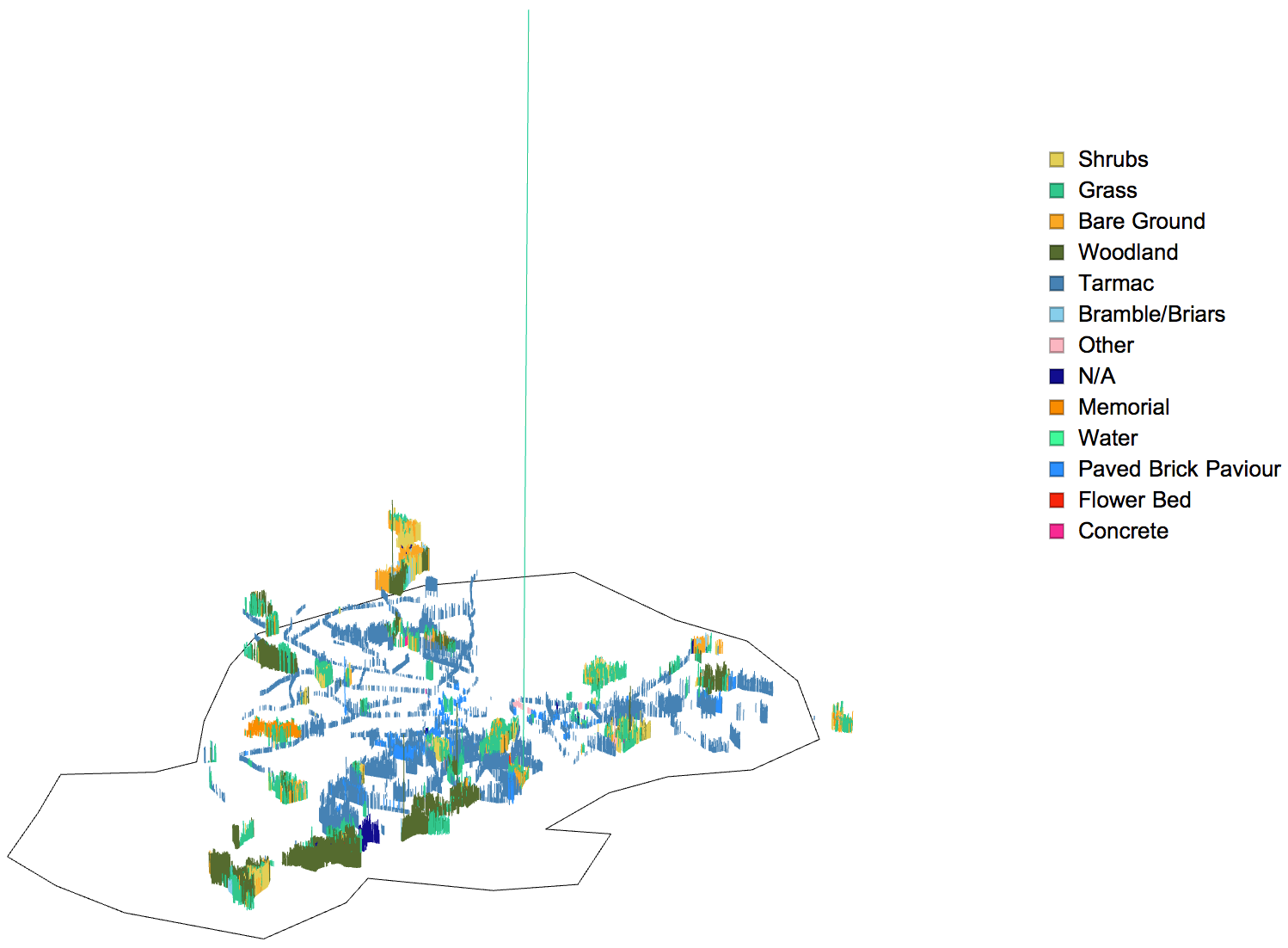
Gorgeous! There seems to be an anomaly though--a tree in a grass surrounding that seems way too tall. We found out that this was the tallest tree in the dataset earlier. We won't bother about the absurd spread radius because the model only accounts for the height of the tree.
1(* just to confirm *)2Table[i -> Quantity[IntegerPart@Max[Select[datasetPos[;; , {"LONGITUDE", "LATITUDE", "TREESURROUND", "TREEHEIGHTinMETRES"}][[ ;; ]], #"TREESURROUND" == i &][[;; , -1]]], "Meters"],3 {i, Flatten@Values@Normal@DeleteDuplicates@dataset[;; , {"TREESURROUND"}]}] // Multicolumn
There it is, the -tall tree! Now we can uproot this tree, hence allowing us to zoom in nicely into the model without any distortions. We'll limit at allowable height to and run the same steps as before to generate a new model.
1d4[surround_] := Normal[Values@Select[datasetPos[;; , {"LONGITUDE", "LATITUDE", "TREESURROUND", "TREEHEIGHTinMETRES"}][[ ;; ]], (#"TREESURROUND" == surround && #"TREEHEIGHTinMETRES" <= 800) &]]2 /. {lon_, lat_, srnd_, h_} :> {GeoPosition[{lat, lon}],Quantity[h, "Meters"]};
For a better perspective, we'll generate a series of frames, each having a progressively altered viewpoint and view angle. This will then be stitched into an animation. A better way to prune the overly tall trees is to find and exclude (upper bound) outliers.
1make3DModel[viewPointY_, viewAngle_] := Row[{Graphics3D[{colouredLines, {Polygon[polygonOfMap, VertexTextureCoordinates -> {{0, 0}, {1, 0}, {1, 1}, {0, 1}}]}}, ImageSize -> 700, Axes -> False, BoxRatios -> {1, 1, 1}, Lighting -> "Neutral", ViewPoint -> {0, viewPointY*Pi, Pi}, ViewAngle -> viewAngle*Degree, Boxed -> False], SwatchLegend[First@#, Last@#, LegendLayout -> (Column[Row[#, " "] & /@ #] &)] &@ Reverse@Transpose@colorLists}];2modelList = ParallelTable[make3DModel[i[[1]], i[[2]]], {i, Transpose[Subdivide[# /. List -> Sequence, 50] & /@ {{0, -.4}, {20, 10}}]}];3Export["3DModel_2.gif", modelList, "DisplayDurations" -> .15, ImageResolution -> 200]

Conclusion
In this article—the second of my exploratory data analysis series—data on the trees of Belfast we analysed. Using a range of techniques from varying fields such as graph theory and statistics, I ran an in-depth analysis gaining insight into trees planted in the city.
A few issues with the dataset were found including entries with impossible dimensions. I presume that these were errors in either data recording or entry. However, I highly recommend Open Data NI as a source of vast volumes of freely accessible data (in Northern Ireland).
The code I wrote to perform all analyses and generate all the diagrams are included. I have tested them all to ensure they're working properly, but if you come across any issues, please do not hesitate to drop a comment. You can run the code and further explore the dataset using the Wolfram Open Cloud. It is entirely free!
I hope you have enjoyed reading this article and have learned a thing or two from it. Until next time, keep exploring.
— MS